Branding & Identity | Creative Strategy | Design Systems
AHCU Rebrand
Associated Healthcare Credit Union (AHCU) needed a brand that better reflected its role in serving Minnesota’s healthcare community. The previous identity lacked distinction, relied on dark, dated colors, and had no formal guidelines, resulting in inconsistent visuals across channels and touchpoints.
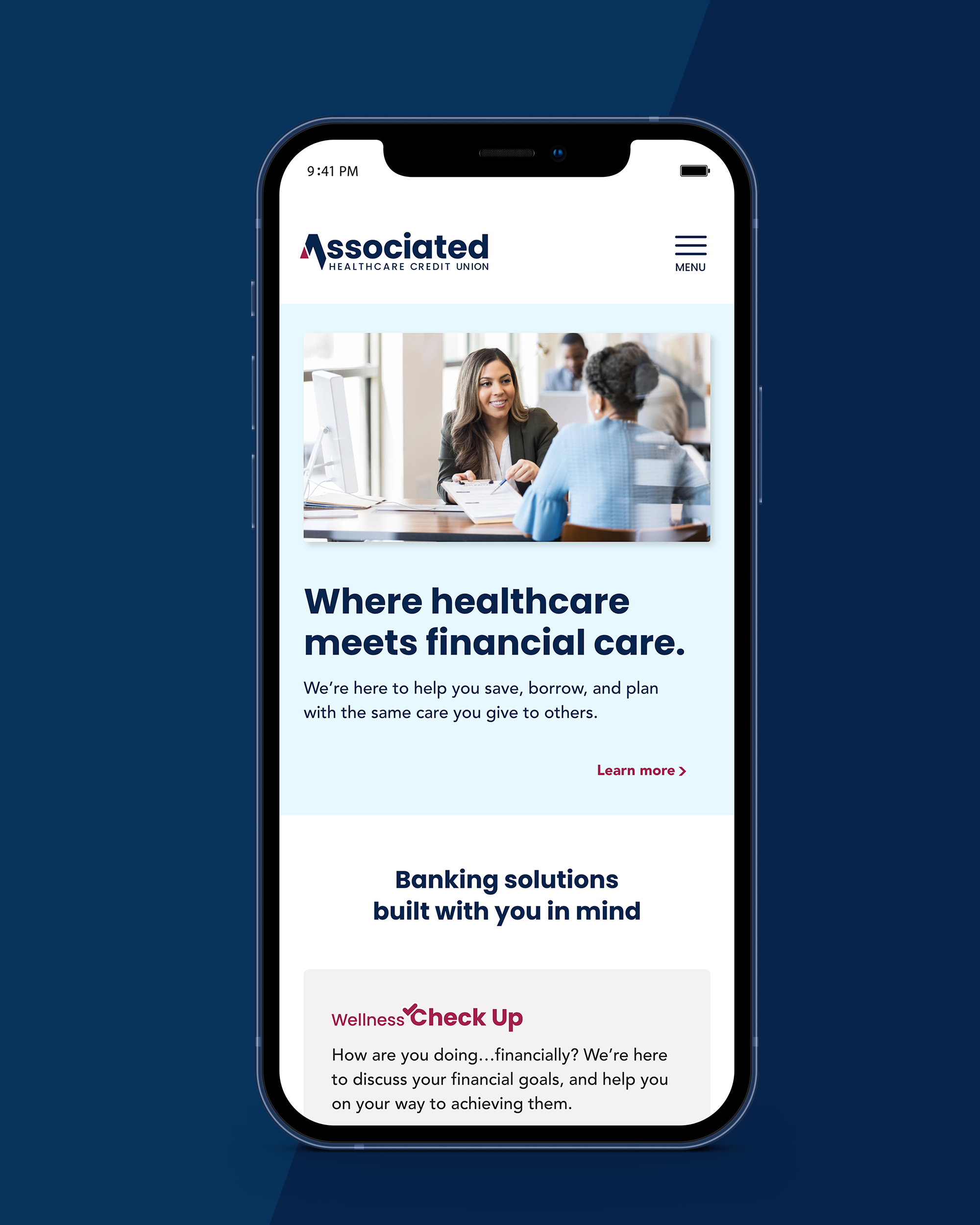
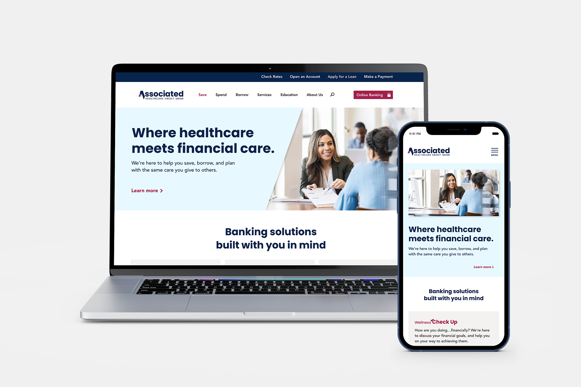
The rebrand established a modern, unified identity rooted in AHCU’s history while elevating its presence across digital, print, and in-person environments. By refreshing the color palette, redesigning the logo, and defining a comprehensive visual system, the brand now communicates clarity, trust, and connection to healthcare with every interaction.
SCOPE
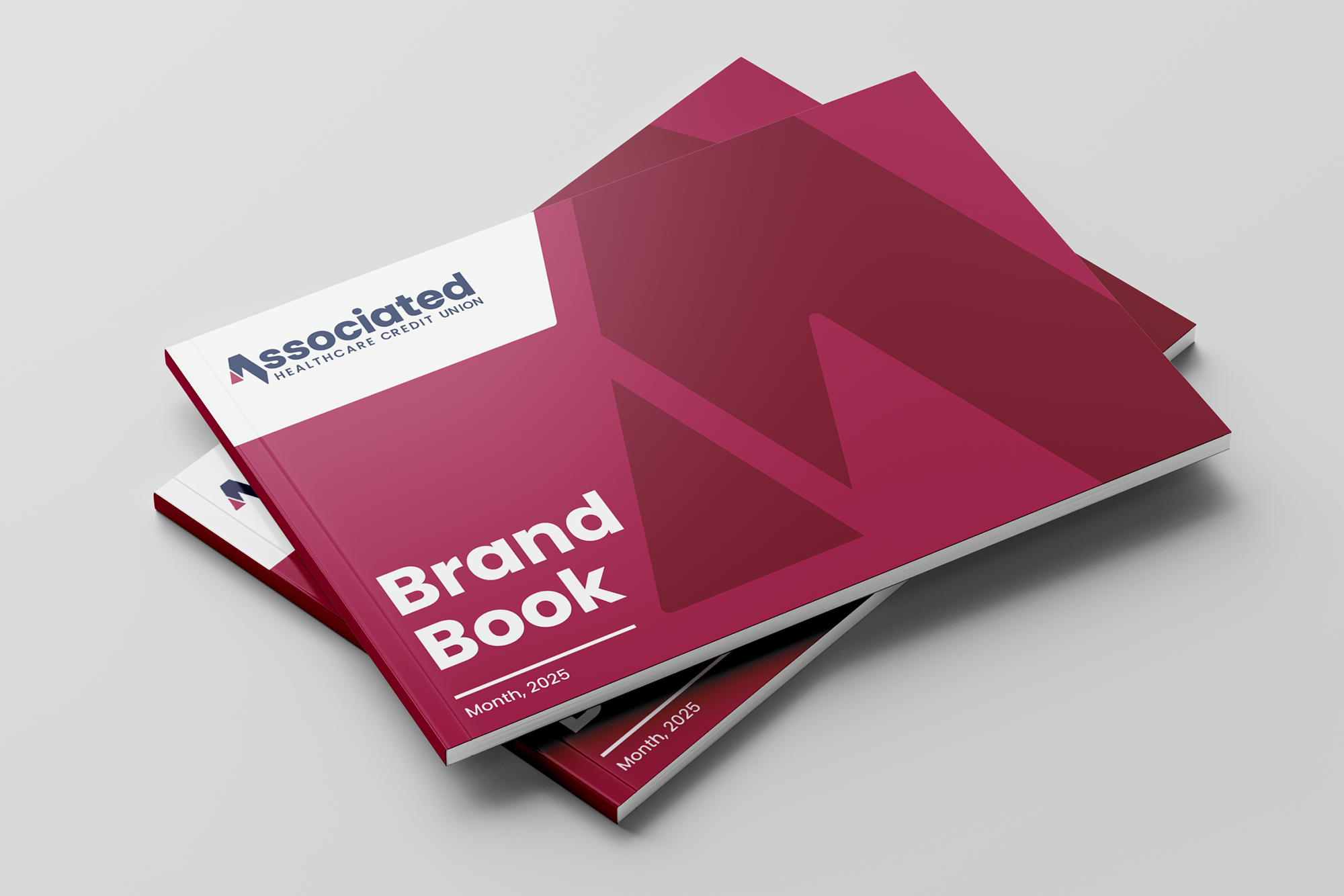
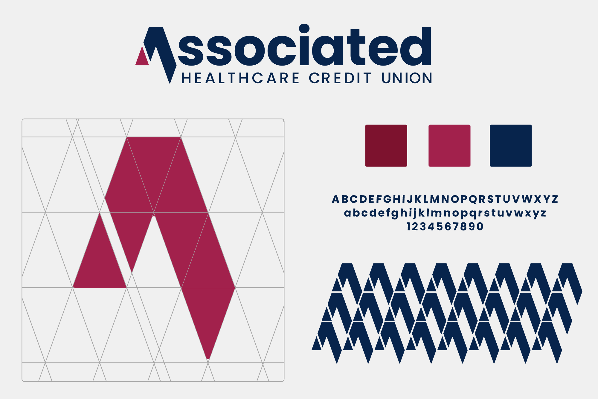
The project included a complete redesign of AHCU’s visual identity and brand system. This encompassed logo exploration, typography, color development, and the creation of brand guidelines to unify usage across digital and physical applications. The new palette blends familiar maroon tones to maintain recognition with a fresh blue that aligns more closely with healthcare environments.
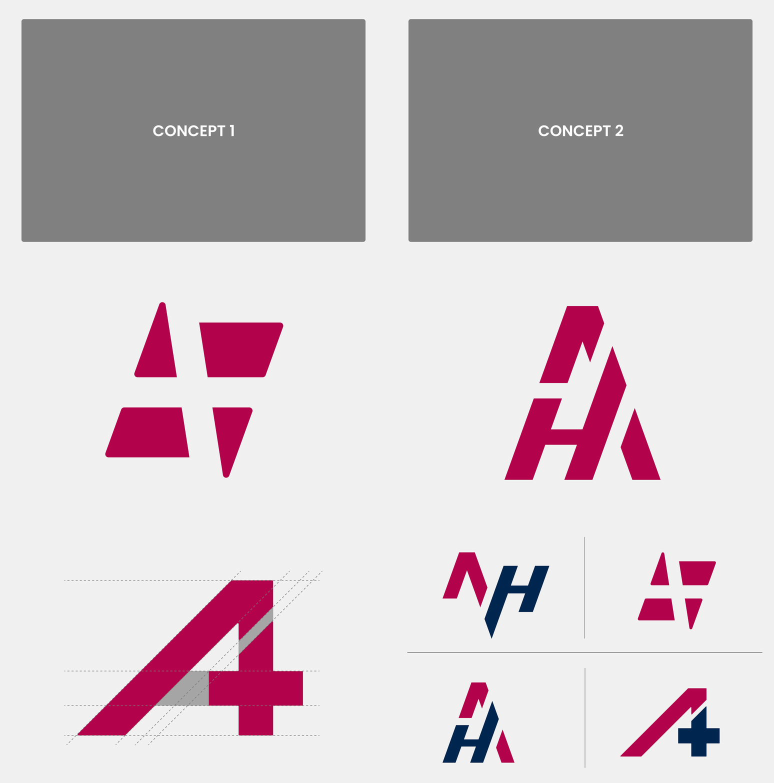
The redesigned mark introduces a distinct triangular form as a nod to AHCU’s legacy, while refining it into a modern, ownable symbol. Additional work included defining imagery direction, voice and tone, membership personas, and applying the system across core touchpoints: website, social, email, branch signage, event materials, and printed collateral.
IMPACT
With a cohesive brand system in place, AHCU now shows up with confidence and consistency across all member touchpoints. The refreshed identity improves recognition, strengthens trust, and better reflects the credit union’s connection to healthcare professionals. Clear guidelines and scalable design tools streamline content creation for internal teams and external partners, reducing inconsistencies and elevating the quality of every execution.
Overall, the rebrand modernizes AHCU’s presence while honoring its roots, building a stronger foundation for growth, engagement, and community connection.
Shaping the Identity
Connected Communications
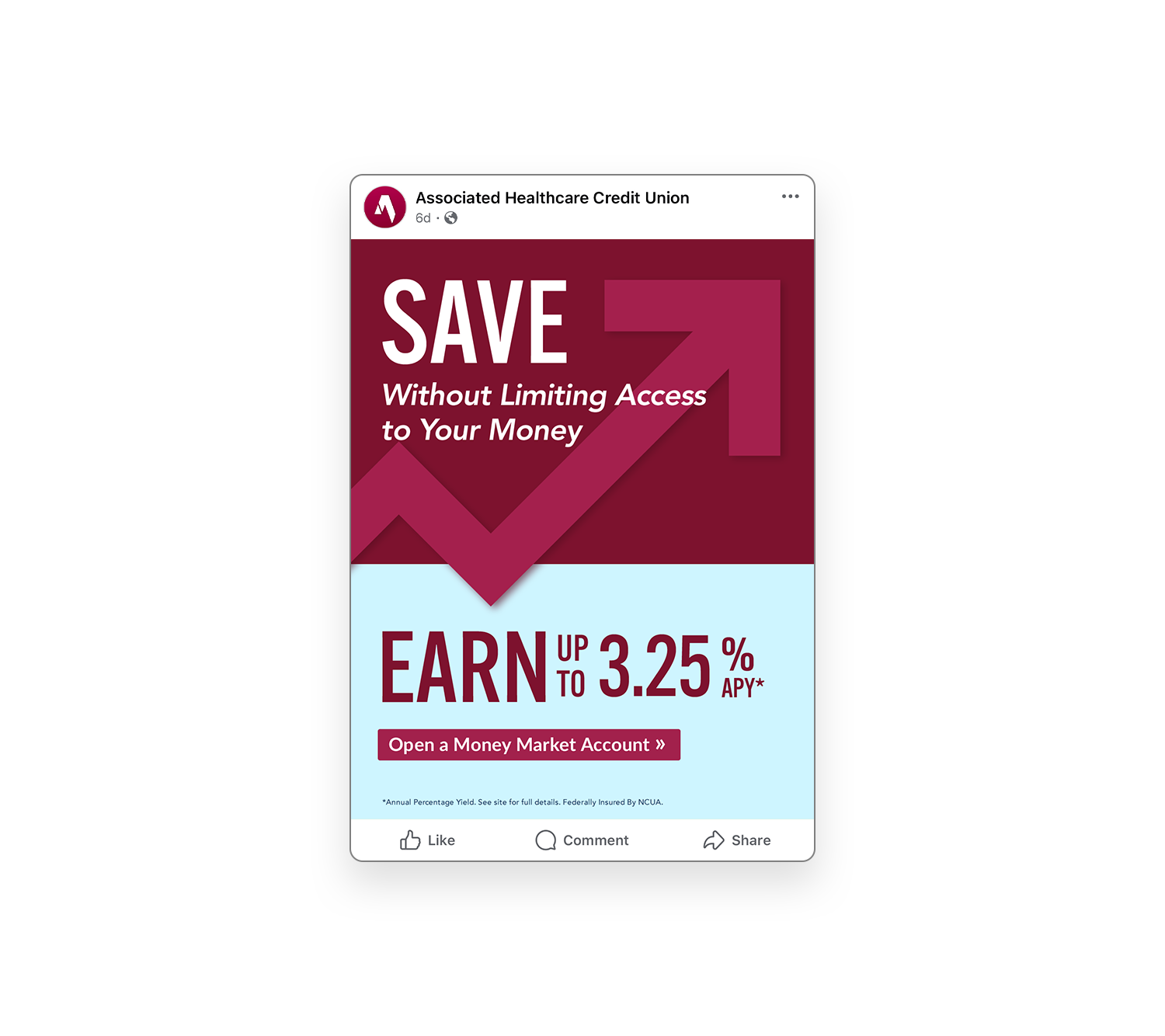
SOCIAL & EMAIL
_
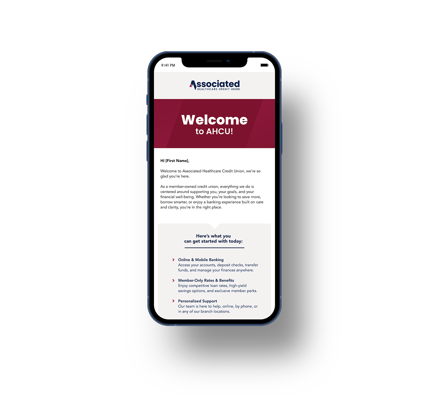
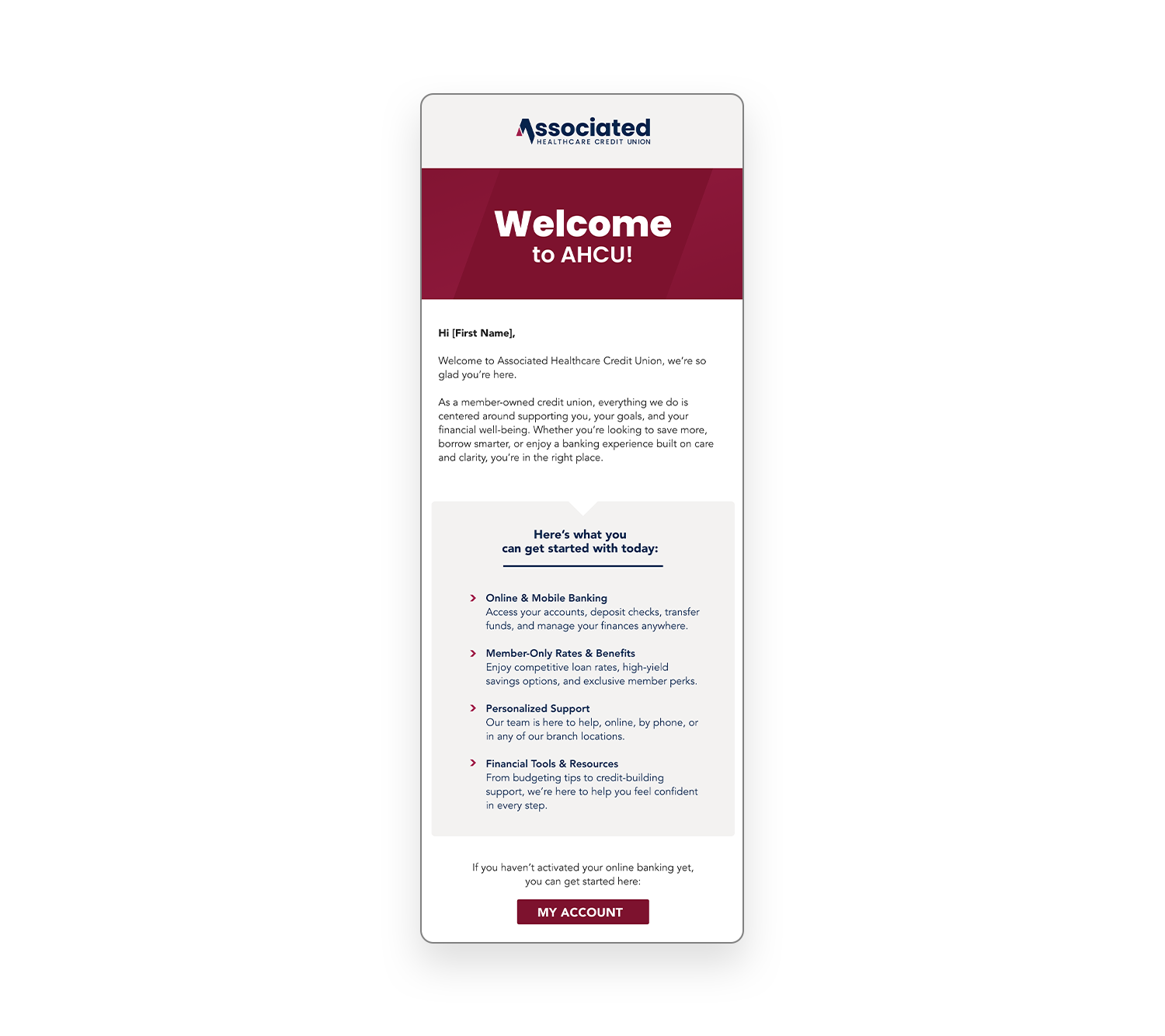
A digital ecosystem designed to educate, engage, and support members wherever they interact with AHCU, driving meaningful action across every touchpoint.


Brand Presence
COLLATERAL & PRINT
_
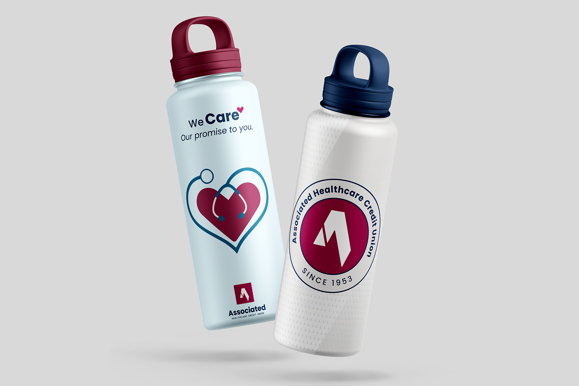
From hospital halls to community events, AHCU’s physical presence strengthens recognition and trust throughout the healthcare community. The refreshed brand adapts seamlessly to booths, signage, giveaway items, and more, helping AHCU show up consistently and confidently wherever members and prospects connect in person.
Through these touchpoints, AHCU builds meaningful awareness among healthcare workers and their colleagues.


