Branding | Omnichannel Campaign | Event Activation
North Oaks Branding
I led the rebrand and full creative refresh for the North Oaks Holiday Home Tour & Boutique, an annual event supporting the Children’s Hospital Association. My goal was to elevate the event’s visual identity to feel timeless yet approachable, balancing holiday charm with a modern, boutique aesthetic. The new brand system unified all touchpoints (print, digital, and event materials) while giving the event a stronger sense of warmth and community connection.
SCOPE
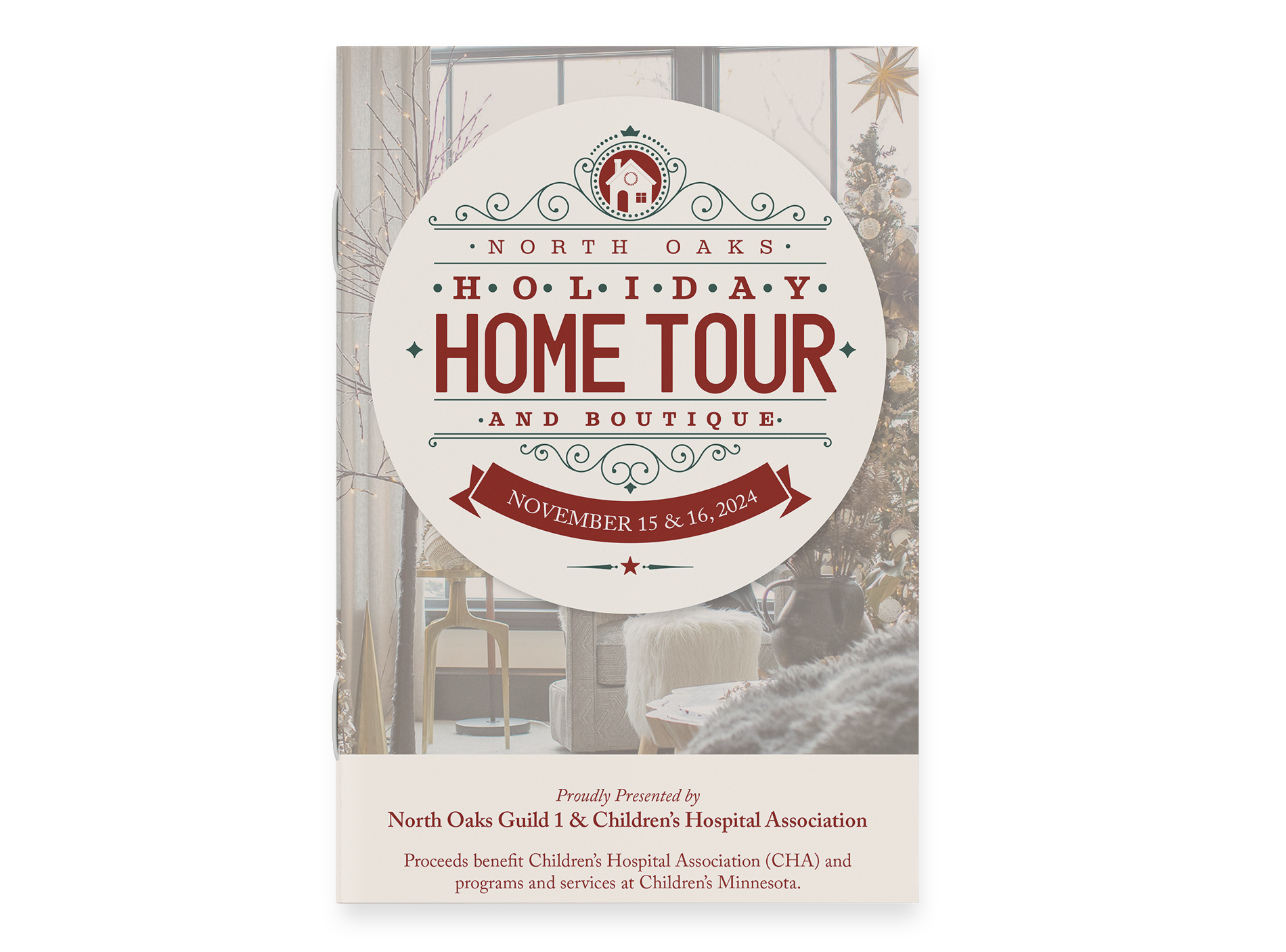
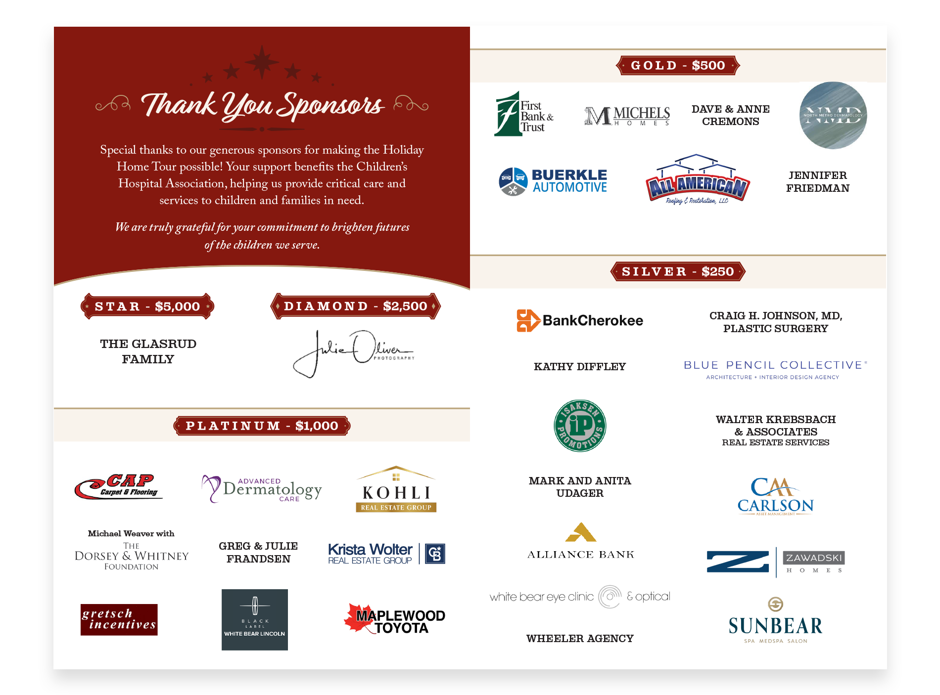
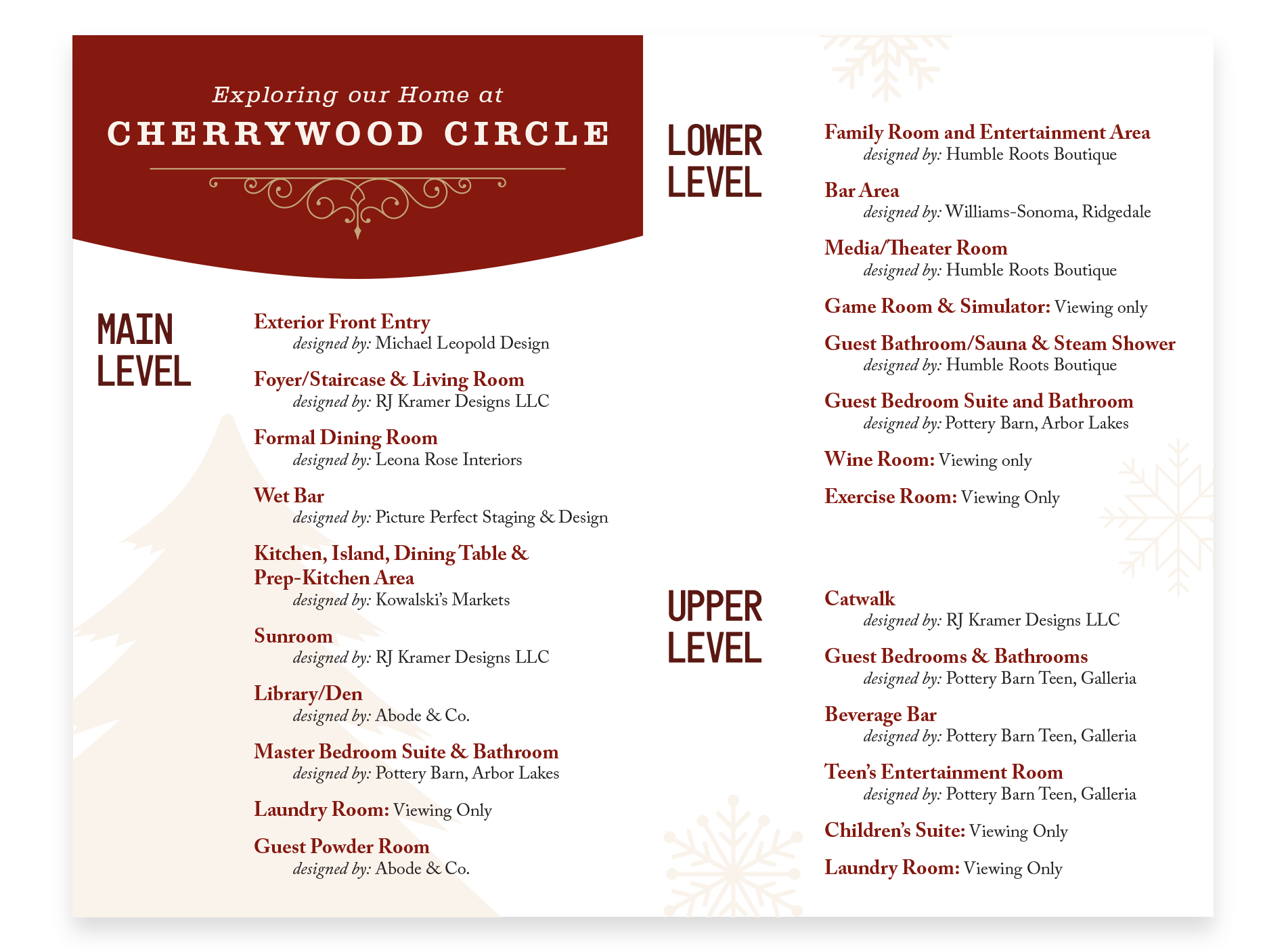
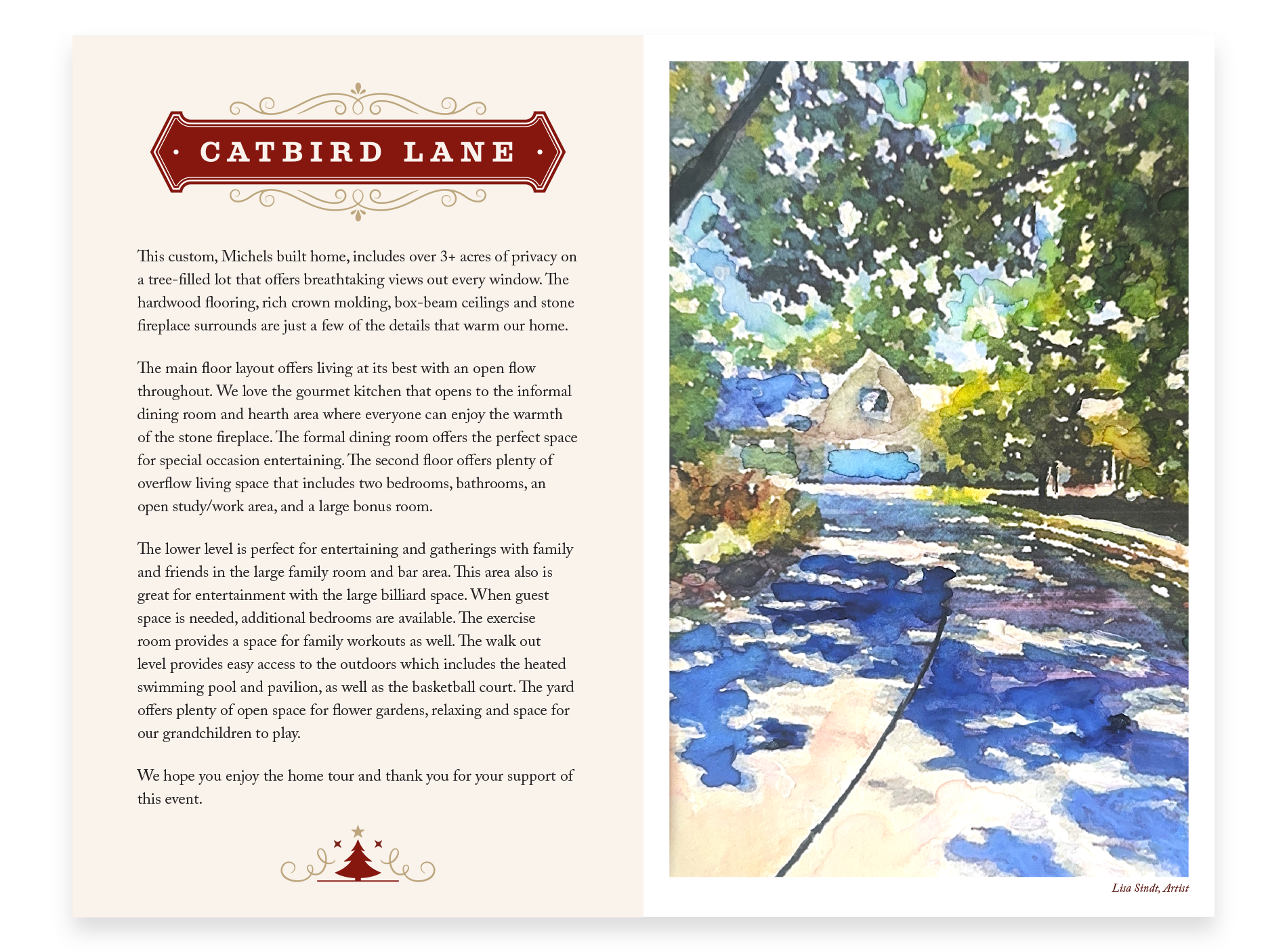
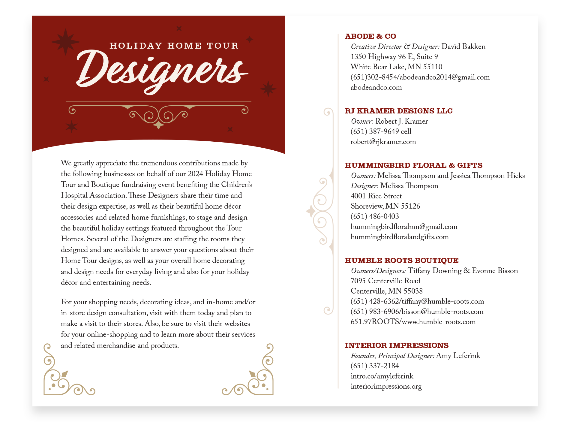
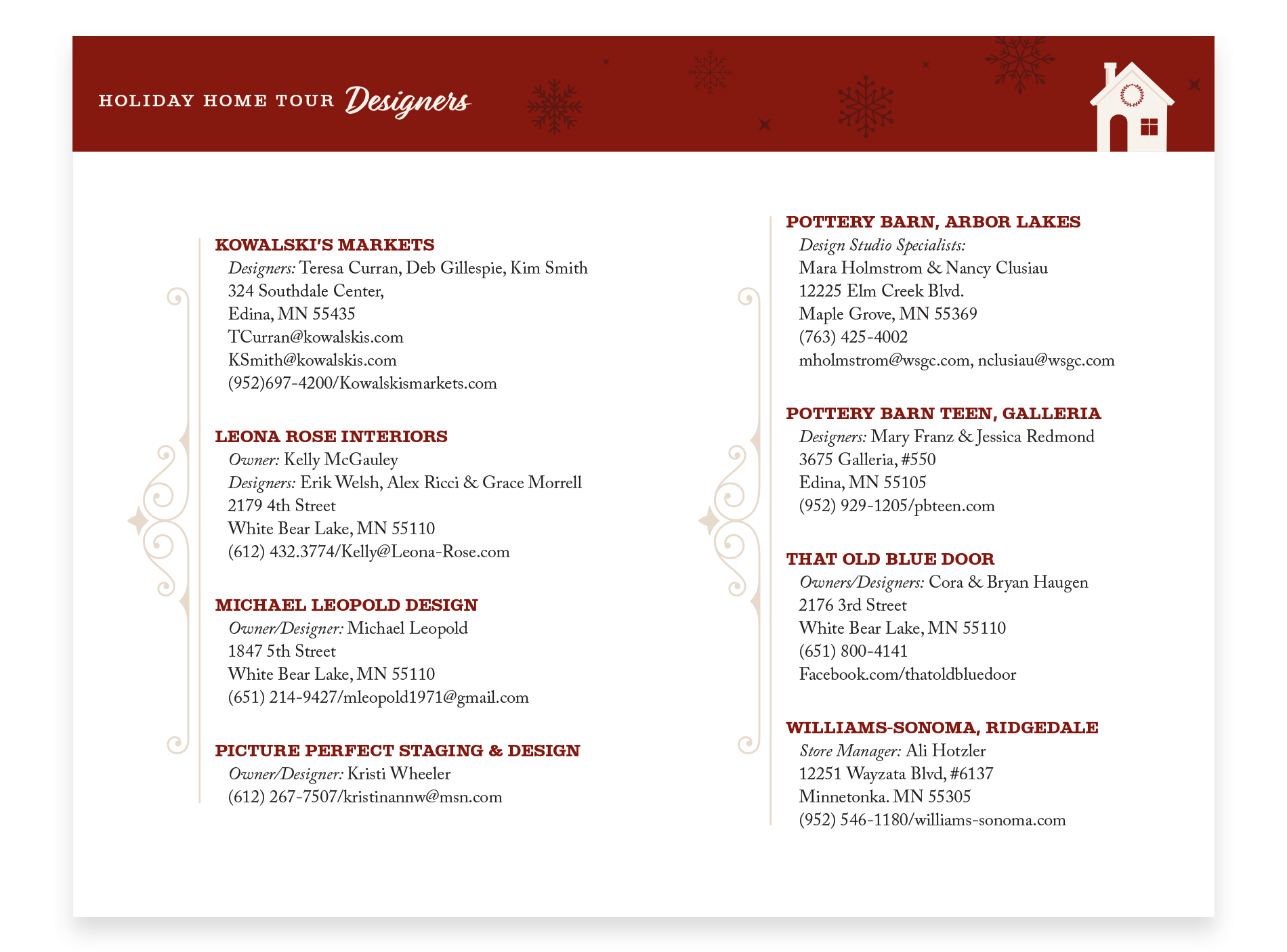
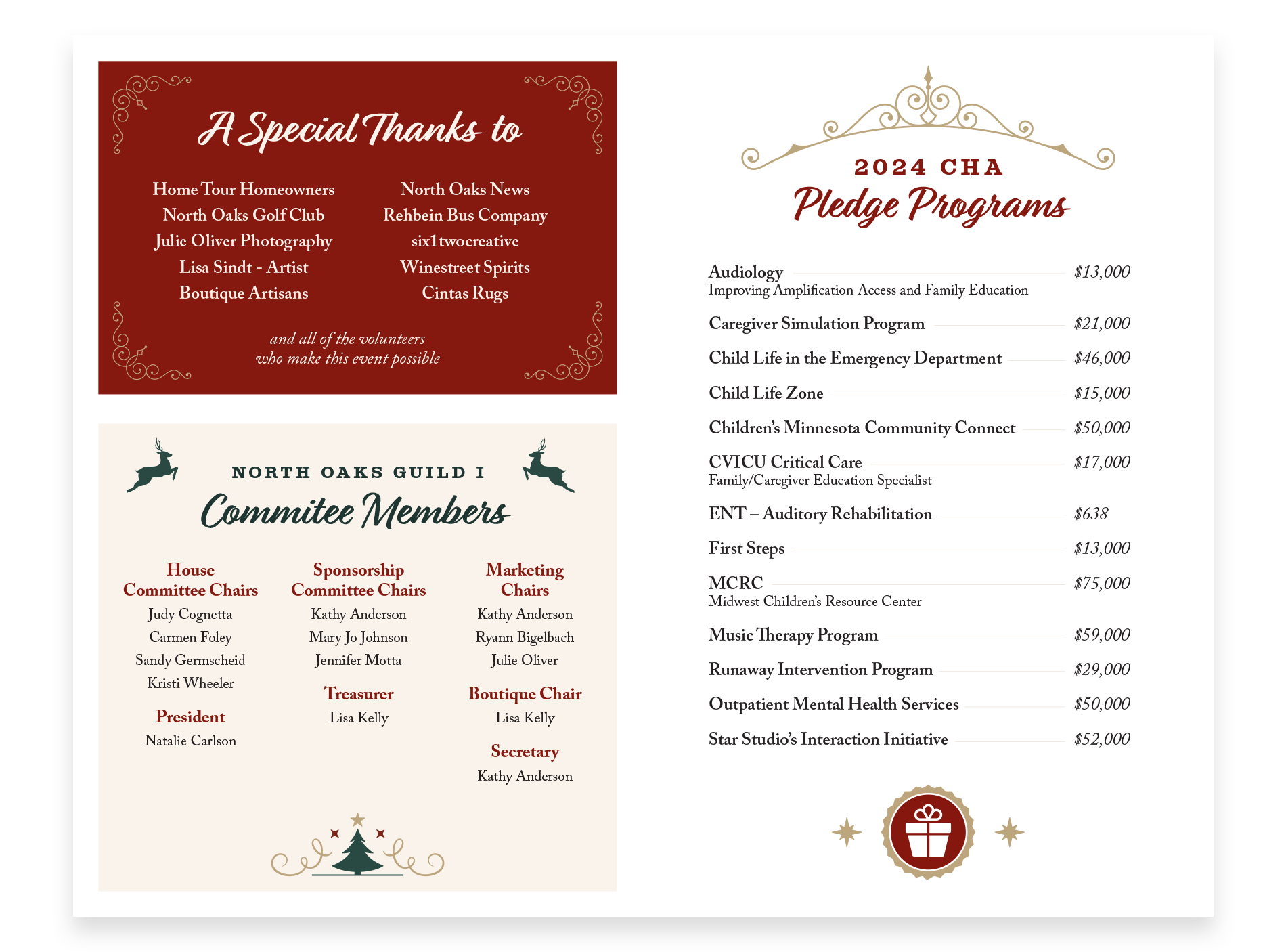
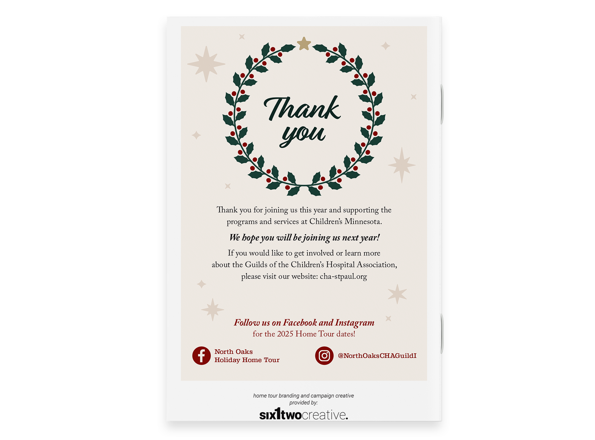
I developed a refreshed logo and brand identity, established a cohesive color palette, typography system, and supporting graphic elements. From there, I applied the updated look across all marketing assets, including invitations, social posts, signage, printed programs, and event merchandise. Each piece was designed to work seamlessly together, ensuring consistent storytelling across channels and easy application for future annual use.
IMPACT
The rebrand resulted in a more recognizable and scalable identity that stood out across both digital and physical applications. The cohesive design system improved brand consistency and made it easier for volunteers to implement materials year after year. Feedback from attendees and organizers reflected that the refreshed look felt more professional, festive, and representative of the North Oaks community, helping the event strengthen its connection to donors and attendees.
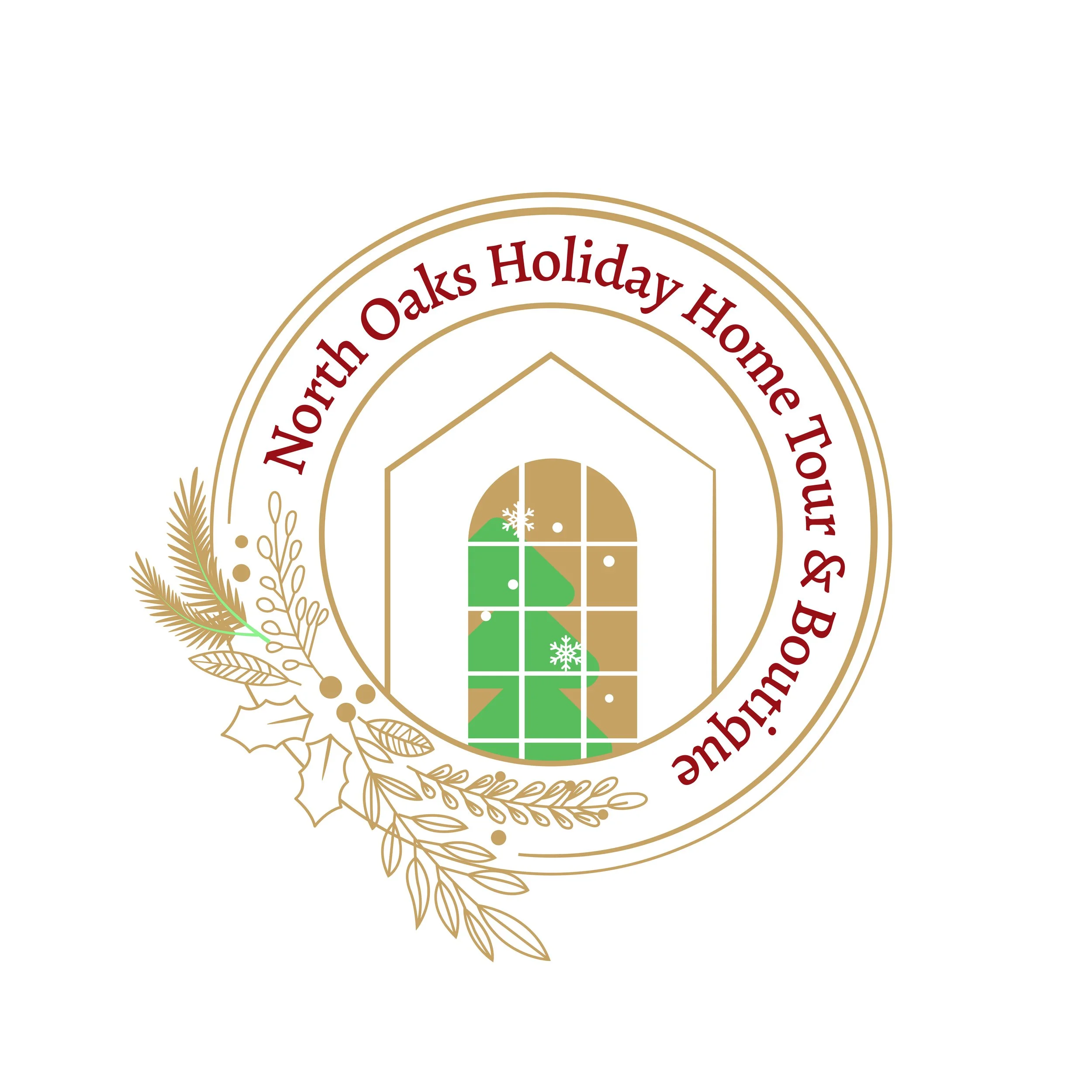
To begin the redesign, I analyzed the existing logo through the lens of legibility, memorability, scalability, and flexibility. While the original design carried a festive charm, its fine lines and intricate details limited clarity at smaller sizes and reduced impact in digital formats.
During concept development, I considered how better to represent the event’s warm, handcrafted spirit while ensuring it felt modern, timeless, and cohesive across applications. I explored ways to balance elegance with approachability, key attributes of the North Oaks community and its annual holiday tradition.
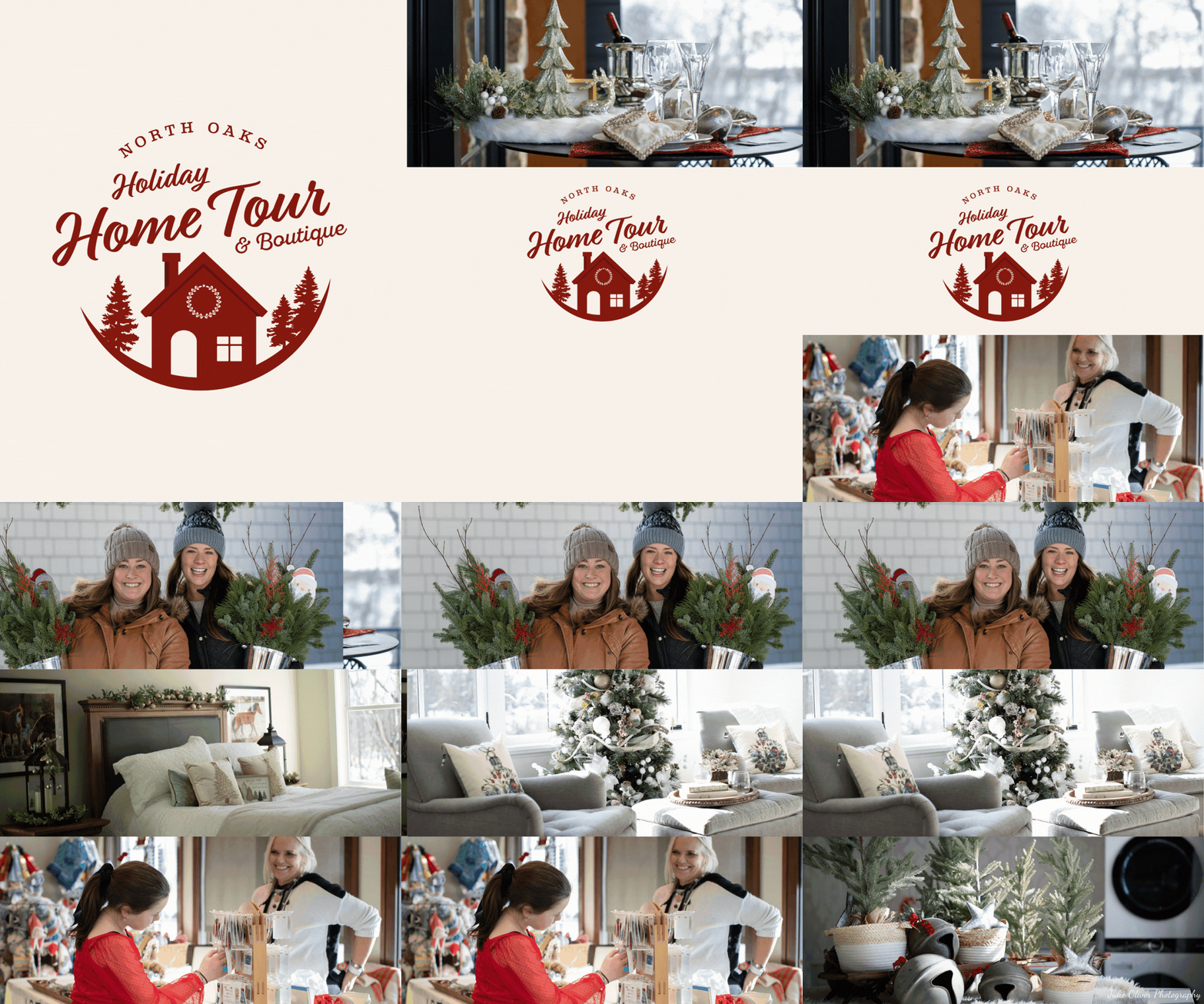
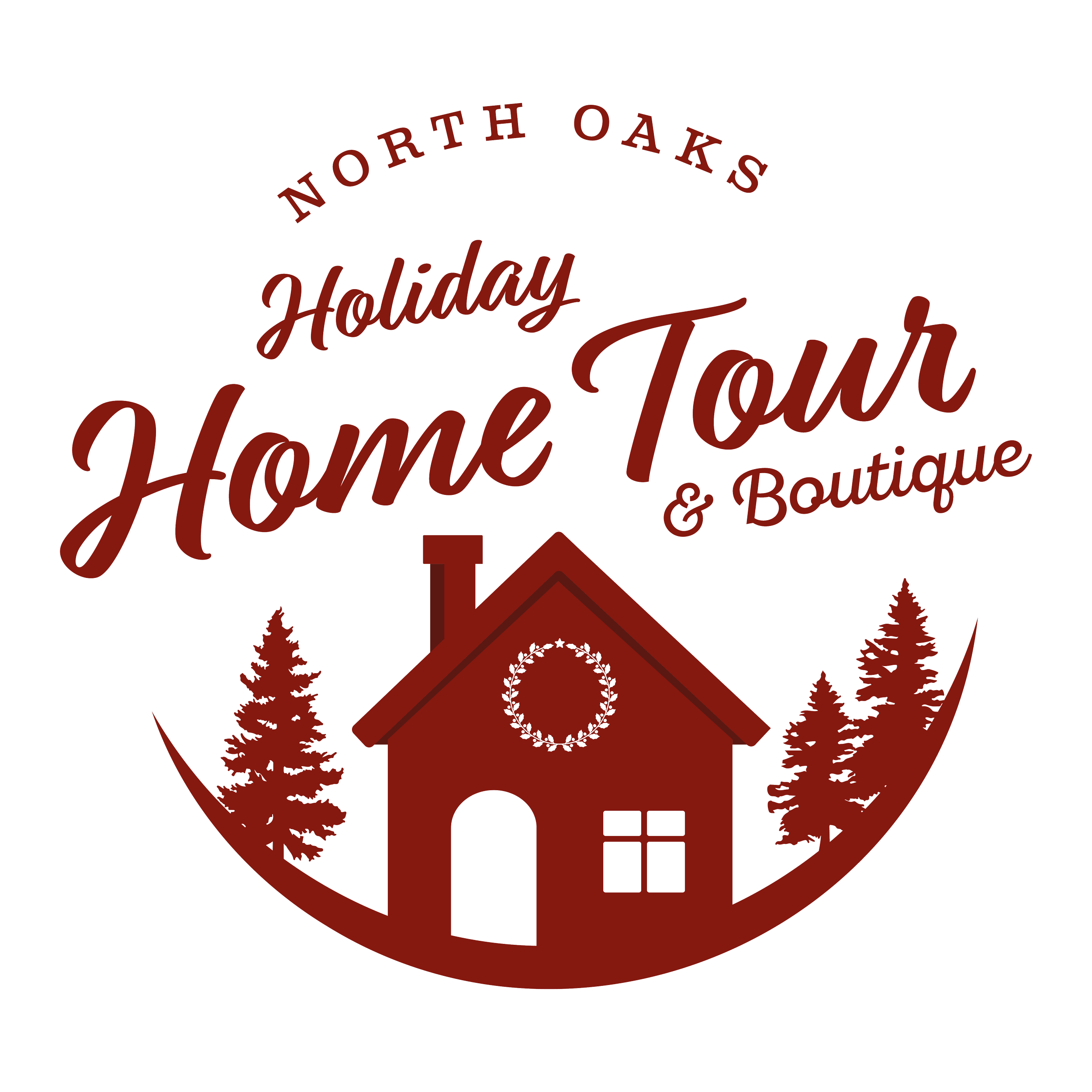
The resulting logo simplifies the visual language with a clean, recognizable house silhouette, seasonal accents, and refined typography that evoke nostalgia and sophistication. The new mark maintains the warmth of the event while offering a versatile, scalable solution that translates seamlessly from digital promotions to signage and print collateral.
THE BRAND REFRESH

