North Oaks
Home Tour
Transforming a static event page into an immersive website experience supported by a cohesive event campaign.
Project Snapshot
_
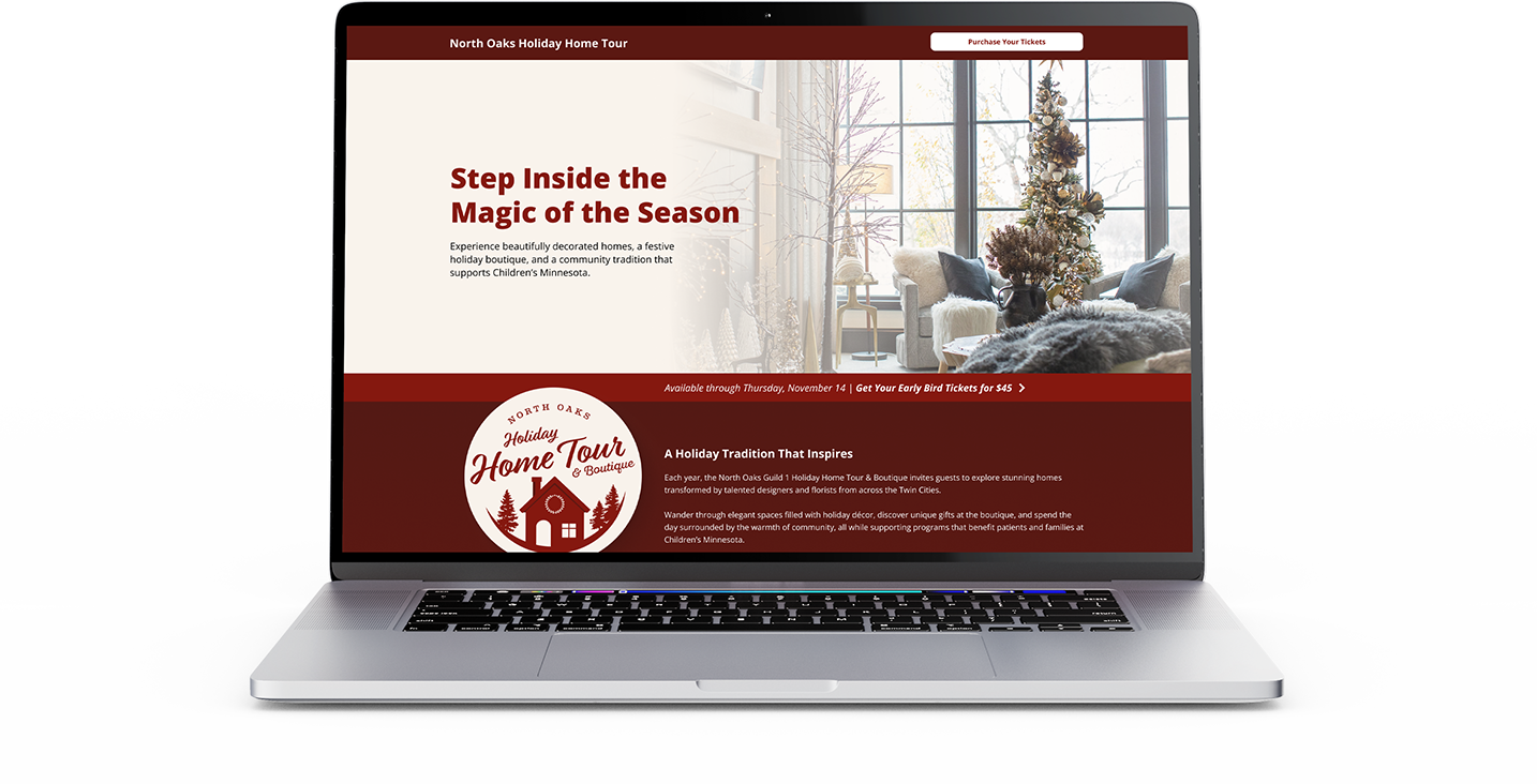
I redesigned the digital experience for the North Oaks Holiday Home Tour & Boutique, an annual fundraising event benefiting Children’s Minnesota. The project centered on transforming a text-heavy event page into a visually engaging website that could inspire attendance, communicate event details clearly, and elevate the overall perception of the event.
Supporting the website, I developed a refreshed brand identity and campaign assets to ensure a cohesive experience across digital and physical touchpoints.
CLIENT: North Oaks Guild & Children’s Hospital Association
PROJECT TYPE: Event Website + Campaign Identity
SCOPE: Website design, event brand refresh, digital storytelling, campaign collateral
ROLE: Art Director & Lead Designer
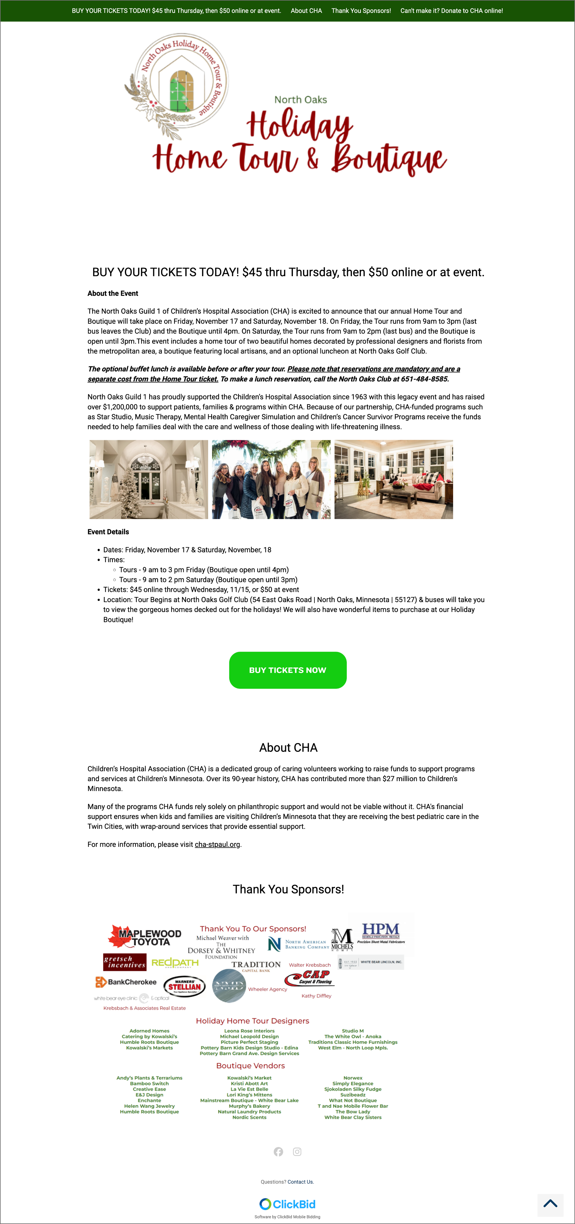
The previous event website functioned primarily as an informational page rather than an engaging experience.
While the event itself was immersive and beautifully curated, the digital experience failed to capture that excitement or effectively convert visitors into attendees.
The Challenge
INFO OVERLOAD VS EXPERIENTIAL
_
PAIN POINTS
Dense blocks of text that made event details difficult to scan
Minimal visual storytelling to showcase the homes and experience
No emotional connection to the event’s festive atmosphere
A lack of branding to support event marketing & collateral
Opportunities
_
The website redesign opened the opportunity to reposition the website as the primary storytelling and conversion tool for the event.
GOALS
Capture the emotion of the holiday season
Create excitement by showcasing the experience
Clearly communicate logistics and event details
Guide users seamlessly toward ticket purchase
Approach
_
1. VISUAL STORYTELLING
Large lifestyle imagery to immerse visitors in the atmosphere of the homes, boutique, and event experience.
2. INFORMATION HIERARCHY
Content was reorganized into scannable sections to make it easy for visitors to quickly understand:
What the event is
What experiences are included
When and where it takes place
How to attend
3. CONVERSION FOCUSED LAYOUT
Calls to action were strategically placed throughout the page to guide users toward purchasing tickets without disrupting the browsing experience.
The redesign focused on three key principles:
Execution
_
The redesigned website introduced a modern, visually engaging structure that balanced storytelling with clarity.
KEY IMPROVEMENTS
Content Sections for Key Experiences
Scannable Event Details
Mission Integration
Strategic Calls to Action
Impact
_
The redesigned website transformed the event’s online presence into a more engaging and effective promotional platform.
OUTCOMES
Elevated the quality of execution to align with the event
Created a stronger emotional connection through visual storytelling
Provided a cohesive brand system that could extend across marketing channels
Increased awareness and attendence
SUPPORTING BRAND & CAMPAIGN ELEMENTS
To reinforce the digital experience, I developed a refreshed event identity and applied it across supporting materials including:
Event logo and visual identity
Promotional graphics
Printed collateral
Sponsor recognition materials
These assets ensured the event maintained a consistent visual presence across both digital and physical environments.


